
In this guide we will cover:
Highlights are a great way to highlight content on a page, and help a visitor to your website to continue their journey on the website by clicking through to a new page when presented with a Highlight that has content related to the page.
Highlights are created within a separate Menu item, the Advanced Module, within the CMS and once published will populate the Choose Highlights section with all available Highlights within a General Page. You can then select the Highlights you want to display on the page, as well as select the style that you would like them to display.
Highlights are a great example of how module content works where highlights content is created in one section of the CMS, and then selected within another section of the CMS to publish this on the front end.
How to create a Highlight
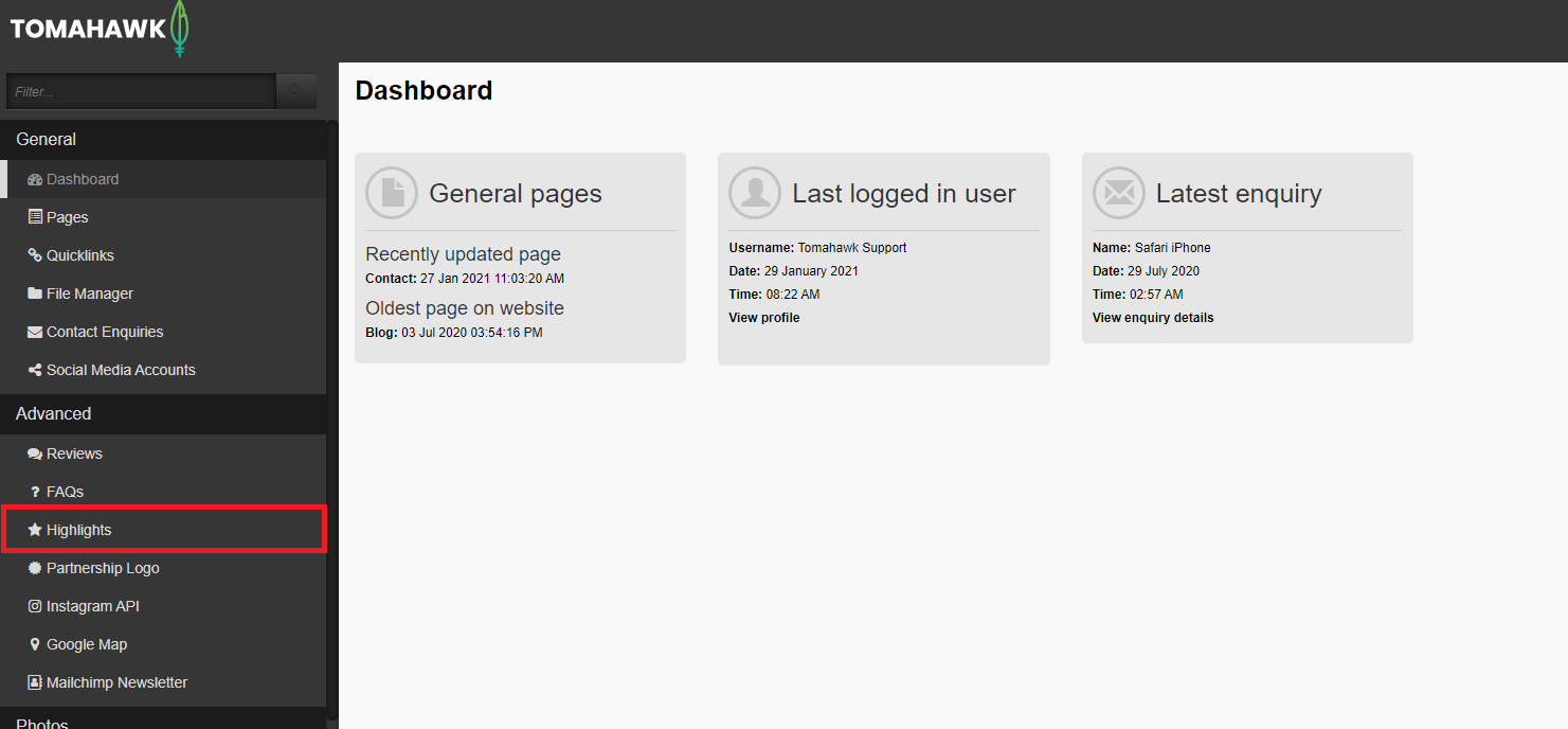
- Log in to the CMS with your Username and Password, then navigate to the Advanced menu, then select Highlights
- You will be presented with a list of all Highlights that have been created. To create a new Highlight, select + New at the top of the page.

- You will now need to complete fields for:

- Title: This is the name of the Highlight that will appear on the front end, and within the CMS as the title, and is limited to 100 characters including spaces.
- Image: You can select a single image to use on the Highlight from the File Manager. As each of the four styles of Highlights prefers a different image size, with these detailed below, it is a good idea to have in mind the style of Highlight you would like to display on a page ahead of creating a Highlight, and selecting the best sized image for the style.
- Image Alt Text: A great way to support search by adding a brief description of what appears in the image. Alt text (alternative text) describes an image on a page, helps visually impaired people understand what the image shows so it is good for accessibility, helps search engine bots understand image contents, and appears on a page when the image fails to load.
- Page ID: In this field you will need to select an internal page on the website from a drop-down menu that a user will be directed to should they click on the Highlight. You are only able to choose from Parent and Child Pages in the General Menu.
- Url: Should you wish to direct a user to a page not available within the Page ID drop-down menu, or you want to link a user to an external website, enter the full URL to direct the user to this page.
- Short Description: Add in a brief amount of text to help introduce the content that sits on the page that you are encouraging people to click through to. This field is limited to 150 characters, including spaces, so it should be kept brief. It is not compulsory to add a Description.
- Save: When all fields have been completed, select the Save button at the top of the page and you will be directed back to the list of all Highlights where your Highlight will show that it has been saved as a draft or with a status of HIDDEN (orange).
- Save Rank: Scroll to the bottom of the page to locate your Highlight that is HIDDEN / not yet published and enter the number or rank which will set the order that your Highlights will appear in within this list, it is not compulsory to add a rank.
- Publish: Select the checkbox next to the name of your newly created Highlight. Select the Publish button at the top of the page, and your Highlight is now available to select on a General Page. It will now show in the Highlights list with a green status of PUBLISHED.
The Four Styles of Highlights
Before we look at adding a Highlight to a Page, let's first look at the four different styles of Highlights you have to choose from.
- Default: This displays a stand-alone image that takes up 50 per cent of the right-hand side of the Highlight, with a Title, Description, and a CTA button that takes up the other 50 per cent of the space. The image, Title, and CTA button when clicked, will direct the user to the page of the URL that has been set. The Default option displays the first Highlight with an image on the right-hand side, and a second Highlight with an image on the left-hand side, with all subsequent Highlight alternating
The recommended Image size is 470px x 600/250px.
- Tile: This displays an image at the top of the Highlight, with a Title, Description, and a CTA button that takes up the bottom 50 per cent of the space, in a column format. The image, Title, and CTA button when clicked, will direct the user to the page of the URL that has been set. The Tile option displays 3 Highlights in one row. Adding a fourth Highlight will add navigation arrows to the left and the right of this section to allow a user to click through a carousel. The carousel automatically progresses through all Highlights when more than 3 Highlights have been selected.
The recommended Image size is 420px x 250px.
- Icon: This displays a block of colour in a row with a maximum of 3 Highlights that can be set to display. The Icon style displays a small image at the top or left of the Title, with a description that is aligned to display underneath the Title. This Icon style does not show any part of the Highlight as hyperlinked or able to navigate to a set page URL. However, the Title when clicked, will direct the user to the page of the URL that has been set.
The recommended Image size is 64px x 64px.
- Choose Featured Highlights: This displays a large, right aligned image, and an overlapping text box featuring a Heading, Description and CTA button. When more than one Featured Highlight is selected within the CMS, you will see navigation arrows to the left and the right of this section on the front end to allow a user to click through a carousel of Featured Highlights. The carousel automatically progresses through all Highlights when more than 2 have been selected.
The recommended Image size is 1045px x 600px.
How to select Highlights to display on a General Page


- Navigate to the General menu, then select Pages. Now select a Page that you would like to add highlights to.
- Select the Highlights tab. Here you will need to complete fields for:
- Heading: Add brief text to this free text field to introduce the Highlight content e.g.: Explore Further, See More. It is not compulsory to add a Heading.
- Description: This is a free text field that allows you to set the text, limited to 250 characters, that displays underneath the Heading. It is a good way to add context as to what the Highlights are focusing on. This only displays on the Tile, Icon, and Featured Highlight Styles. It is not compulsory to add an Introduction.
- Url: In this field you can add a link to another page within the website.
- Button Text: This is a free text field that allows you to set a custom CTA for the link you added in the URL field e.g.: Learn More. This only displays on the Icon Highlight Style.
- Choose Highlight Style: This is a single select option.
- Choose Highlights: It is recommended to select, by checking the tick box next to the title of a Highlight, a maximum of 3 or 4 Highlights to display on a page. These will be displayed at the bottom of the page underneath the primary page content with your set Title, Description and CTA Button. You are able to set a rank or number for the order that you would like your Highlights to appear in on the front end. In the example above, you can see that Highlights 1 - 3 have been set in ascending order.
- Choose Featured Highlights: This displays a large, centred image, and an overlapping text box featuring a Heading in red text, a Description and CTA button in the Tertiary style. This style features one Highlight at a time, that will automatically cycle through all Highlights in a carousel.
You cannot select a Featured Highlight that has already been selected to display as a Highlight within the Choose Highlights section. If the same Highlight is selected for both the Choose Highlights and Featured Highlight sections, the Featured Highlight will take priority. This means that the selected Highlight will not show or be removed from the Choose Highlights section on the front end, and will be featured in the larger Featured Highlight.
4. Once you have selected the Highlights you want to display on a page within the Highlights tab, you will then need to select the Modules tab within the Page you are working on and add a rank next to the Highlights field. Adding the rank of 1, as in the example below, means that your selected Highlights will display after the Heading, Introduction and any additional content added in the Rich Text Editor (within the Content tab) on the Page on the front end.

You can also refer to our video on how to create highlights:
💡 Things to Remember:
-
As each of the four styles of Highlights prefers a different image size, it is a good idea to have in mind the style of Highlight you would like to display on a page ahead of creating a Highlight, and selecting the best sized image for that style.
- Remember that you cannot select a Featured Highlight that has already been selected to display as a Highlight. If the same Highlight is selected for both the Highlight and Featured Highlight sections, the Featured Highlight will take priority.
- When selecting the Icon Style highlight, it is recommended you use an icon in the image field.
- To ensure that the images display the same size when using the Tile Style Highlight, we recommend using a Canva template to resize your image to fit the space to help keep the display consistent. Otherwise, you may find that some of the Highlights have shorter images than others.
- Remember that once you have selected the Highlights you want to display on a page within the Highlights tab, you will then need to set a rank next to the Highlights module, within the Modules tab for the page you are working on.
- The style of text and use of colours throughout these Highlights will be unique to you and the design of your website.