
In this guide we will cover:
What is a General Page
All pages that appear in the topline navigation menu on your website are General Page types; this is a type of page with some specific features that allow you to create page content, select content from modules to display, and link to other pages across your website using Quicklinks and Highlights.
The point of difference with a General Page is that it has a Rich Text Editor, that allows you to format text, add in hyperlinks, tables, images, links to a PDF document, or a bullet pointed or numbered list.
In this guide we will work with the example of creating a new General Page. You will need to have logged in to the CMS using your Username and Password, navigate to the General section of the CMS, then select Pages.
Select + New at the top of the page, and you will be taken to the first out of eight tabs that you will need to add content.

1. The Content tab
When you first select a page to edit within the General Pages menu, or create a new page, this will open the page editor to the Content tab where you will need to complete fields for:
- Heading: In this field, you'll create the title or heading for the page
- Introduction: In this field, you'll set the text for the page introduction or description. This field is not compulsory to complete.
- Add new row with
 columns
  : Select the arrow in the drop-down and choose the number of columns that you would like to display content on the page. You can select up to four columns to display on a page. For most pages, you will use a row with 1 column. When selecting 1 column, and then
  this will display the Rich Text Editor text as a single row to add content. You can add multiple rows to a page.
Add new row field with two columns selected - Rich Text Editor: In this section you can add additional text to display below the Introduction. It is not compulsory to complete, so it can be left blank. If you do decide to add additional text, you have the following options from within the Rich Text Editor to format how you'd like the content to display using:
- Columns: Select the arrow in the drop-down field and choose the number of columns that you would like to display content on the page. You can select up to four columns to display on a page. For most pages, you will use a row with 1 column. When selecting 1 column, and then
 this will display the Rich Text Editor text as a single row to add content. You can add multiple columns to a page.
 - Choose heading: In this drop-down you will find a set of font options to use to suit specific text. It is recommended to use the H3 heading for headings or titles, so that the text is smaller than the size of the font used in the Heading field. The Normal option should be used for body text, which you can see has been selected in the example above. There is also an option to create a CTA button by selecting the Button option from the Choose Heading drop-down. Once you have selected this option, simply write your text, highlight it, then select the
 link button in the ribbon at the top of the Rich Text Editor and add in a URL. Best practice is to set the link when clicked to open in a new tab. The text will become the Call to Action (CTA) text inside of the button.
 - Bold, Italic, Underline and Strikethrough text: Select the text you would like to work with by highlighting it, then select from one of these text formatting options.
- Text Alignment: Highlight the text you would like to update the position of on the page, or alignment, then select from one of the text formatting options in the drop-down. You have options to left, right, centre align or justify the text.
- Block Quote: Select the text you would like to work with by highlighting it, then select the Block Quote button in the ribbon at the top of the Rich Text Editor. This will center align the text, and update the text to bold, italic. It will also place a line at the top and bottom of the text to help highlight this content, such as a quote, on the page.
- Link: Select the text you would like to work with by highlighting it, then select the Link button in the ribbon at the top of the Rich Text Editor. This will display a pop-up where you can add in a URL, with best practice to toggle on Open in a new tab option, then select the green tick to save your changes.
- Bulleted List and Numbered List: Select the text you would like to work with by highlighting it, then select either the Bulleted List or Numbered List button from the ribbon to update the text.
- Decrease Indent, Increase Indent: Select the text you would like to work with by highlighting it, then select the Decrease or Increase Indent button to shift text as a block to the left or right.


- Insert Image: Select where on the page you would like to insert an image, then select the folder icon in the ribbon at the top of the Rich Text Editor. This will open the File Manager in a pop-up window across the page you are working on to allow you to choose an image from within the image library. Once an image has been selected, you can resize the image by selecting one of the blue squares at the corner of the image and then click and drag the image to resize.
- Change Image Text Alternative: Once an image has been selected from the Insert Image folder, select the image to display a small pop-up to set the Alt Text on the image. Adding Alt Text to an image is a great way to support search by adding a brief description of what appears in the image. Alt text (alternative text) describes an image on a page, helps visually impaired people understand what the image shows so it is good for accessibility, helps search engine bots understand image contents, and will display the text on the front end when the image fails to load.
- Left Align Image: Once an image has been selected from the Insert Image folder, selecting to left align the image creates space for text to be added to the right of the image. This uses an image from File Manager, an H3 Heading, and normal text, so this is a good way to keep the display of this content consistent and to break up large amounts of text.
- Right Align Image: Once an image has been selected from the Insert Image folder, selecting to right align the image creates space for text to be added to the left of the image. This is a great way to break up a lot of information on a page by alternating blocks of content to be left and then right aligned.
- Insert Table: This is a great option to add into the body of a Rich Text Editor when you have a lot of information that is best displayed in a table format such as flight times across a country. Once a table has been added, you can format the cells to select, add or delete rows and columns, add a header row or column, and merge or split a row or column, as well as resize rows and columns to best fit the page.
- Horizontal Line: This is a great way to break up blocks of content by adding a line to separate information.

- Font Size: As we mentioned in the Choose heading point above the body or Normal text in this section is 20 px font size, which is the Tiny option from this drop-down menu. All font settings from the Page Designs have been automatically set within the CMS, and we recommend for you to use the options from the Heading drop-down menu.
- Font Colour: Select the text you would like to work with by highlighting it, then select the drop-down arrow on the A button in the Rich Text Editor ribbon to display a list of colours to select from, or select the Colour Picker option to add in a #hex code for a colour you would like to set for your text. We recommend that you follow your Brand Guideline as well as the website Page Designs to keep the use of colour consistent,
- Templates: This is a great option to help keep all content across the website consistent. Click on the drop-down arrow next to the
 button to display a range of template options to choose from. Before you select a template, type is some text to act as a placeholder, then hit Enter to set your cursor on the next line down; you can now select a template. After inserting a template, add your cursor to the first line of text you typed, then hit enter again and insert your next template. This helps to keep consistent spacing between each template down the page.
- Cover - Image Left: A template that displays a large, left aligned image, Heading, and Introduction body copy text. Great for introducing new content on a page.

- Cover - Image Right: A template that displays a larger, right aligned image, Heading, and Introduction body copy text. Great to use with the Cover - Image Left template to to alternate the display on content down the page.

- Tile - Image Left: A template that displays a small, left aligned image, Heading, Introduction body copy text, and a CTA Button.

- Tile - Image Right: A template that displays a small, right aligned image, Heading, Introduction body copy text, and CTA Button. Great to use with the Tile – Image Left option to alternate the display on information on a page.

- Button - Primary: This option allows you to set a CTA button to link a user to another page on the site, or to an external URL offsite. Select the text inside the CTA button to set the text to display on the button, and the URL for the page you would like to point people to.

- Button - Secondary: This option also allows you to set a CTA button to link a user to another page on the site, or to an external URL offsite. Select the text inside the CTA button to set the text to display on the button, and the URL for the page you would like to point people to. This will display as a different colour to the Button - Primary Option.

- Button Primary & Secondary: Like the Primary and Secondary buttons, this option from the Template drop-down menu allows you to set CTA buttons to link a user to another page on the site, or to an external URL offsite. When selected, it will display two CTA buttons.

- Cover - Image Left: A template that displays a large, left aligned image, Heading, and Introduction body copy text. Great for introducing new content on a page.
- Columns: Select the arrow in the drop-down field and choose the number of columns that you would like to display content on the page. You can select up to four columns to display on a page. For most pages, you will use a row with 1 column. When selecting 1 column, and then
You can also refer to our video on the Pages Content Tab (it is showing the version deployed for websites built between 2019 and 2023, so you might notice some slight differences in your CMS if your website was built in 2023 or after).
2. The Settings tab

When you first select a page to edit within the General Pages menu, or create a new page, this will open the page editor to the Content tab. Select the next tab over for Settings. Here you will need to complete fields for:
- URL: The URL is automatically created based on the CMS Label and displays on the front end of your web browser at the end of the URL e.g.: www.inspire.co.nz/occassions/weddings. When creating a new page, you can leave this field blank as the URL will automatically be created when you enter text in the CMS Label field. When you save your changes and exit out of the page, and then click back into the Page, you will see that the URL field has populated with the CMS Label name in lowercase letters and using hyphens to replace any spaces between words. If you need to change the URL, for example to correct a spelling mistake, you can edit the URL field. Please ensure that you use all lowercase letters and where there are spaces between words that you use a hyphen (-) instead of a space. Please note that the URL field does not like anything other than plain text, so the use of words with macrons, apostrophes or symbols that have been added to the Menu Label field should be removed from the URL field before you save your changes e.g.: Dave's Taupō Trips & Tramps will display a 404 page on the front end; you'll see that URL will display the text differently:

If you do need to update a URL that is already published and live on the front end, please ensure that a redirect is set up for the old URL. You can read more in the section on Redirects.
- CMS Label: This is the name of the Page that will appear in the General Pages Menu. This displays only within the CMS for you to see.
- Menu Label: This is the name of the Page that will appear in the topline navigation. It is recommended that you keep the Heading from the Content tab, and the Menu Label the same. Adding text to this field sets the name of this option to appear in the topline navigation. Leaving it blank means that it will not appear in the topline navigation options.
- Footer Menu: Adding text to this free text field will create a link to this page in the footer. It is recommended that you keep the Menu Label and the Footer Menu text the same.
- Parent of this page: In our guide on How to set and edit your topline navigation we covered how a General Page can be set as a topline navigation option, acting as a Parent, and how a Child page is able to be set as a drop-down option from the topline navigation from its Parent. Here is a breakdown of how the Page hierarchy works:
- This is the parent: Selecting this option means that your page will appear in the topline navigation e.g.: ABOUT is a Parent Page.
- A General Page e.g.: ABOUT: Selecting this option for a Page means it will become a Child of a Parent Page. It will appear in the topline navigation underneath its Parent e.g. Our Team, and will display as an indent or step underneath a Parent Page within the CMS.


- Hero Banner: This is an image or set of images / video that will display at the very top of a page. You will first need to create this within the Photos module (Hero Banner), outside of the General Pages Menu. Once the Hero Banner has been created, it is then available to be selected from this drop-down field. This is not a compulsory field.
- Page Banner: This is the image or set of images / video that will display midway down a page. You will first need to create this within the Photos module (Hero Banner), outside of the General Pages Menu. Once the Banner has been created, it is then available to be selected from this drop-down field. This is not a compulsory field.
- Gallery: This is the image or set of images / video that will appear after the Introduction / Description on a page. You will first need to create this within the Photos module (Photo Gallery), outside of the General Pages Menu. Once the Image Gallery has been created, it is then available to be selected from this drop-down field. This is not a compulsory field.
- Form: This drop-down allows you to select a pre-designed form from the Advanced > Forms Module and select to display this on a page.
You can also refer to our video on the Pages Settings Tab (it is showing the version deployed for websites built between 2019 and 2023, so you might notice some slight differences in your CMS if your website was built in 2023 or after)
3. The Modules tab

The third tab you'll see is Modules. Modules are pieces of content that exist outside of the General > Pages menu and can be selected to display on a General Page. Examples of module content are Accommodation (rooms), Blogs, Experience (Packages), FAQs, Highlights, Quicklinks, and Reviews. This content is created in its own separate section of the CMS, and the Modules tab is where you select to display this content on a page.
They display after the main content on a page, and you can set up the order that modules display in, by assigning a rank (or setting numbers) against each module that you want to display on a page.
Add a number to the box to add additional functionality to this page (e.g. Adding a number to 'Google Map' will allow you to have Google Map on this page).
The options you have to select to display on a page, and the pages recommended for these to be displayed on are:
- Accommodation Module
What does it display? Card style blocks of content with an image, icons for room details, a brief introduction, pricing, and CTA buttons to the landing page for the room or booking engine.
Set this to display on: Your accommodation Parent/Landing Page.
- Blog Module
What does it display? Card style blocks of content with an image, title, post date, brief description and a hyperlinked Read more text that navigates the visitor to the Blog on its own URL.
Set this to display on: Your Blog landing Page
- Experiences (Packages) Module
What does it display? Card style blocks of content with an image, title, package details date, and CTA buttons to the landing page for the package or booking engine.
Set this to display on:
- FAQs Module
What does it display? A list of all created questions and answers
Set this to display on: Your FAQs page
- Google Map Module
What does it display?
Set this to display on: Your contact page. You can read more about how to get a map to a set location to display in our guide on Setting up Google Maps
- Highlights Module
What does it display? Highlights that have been created within the Highlights (Advanced) section of the CMS, will populate to show within the Highlights tab on a General Page. A selection of Highlights can then be ticked to display on the page.
Set this to display on: Any General Page


- Instagram Module
What does it display? A linked block of text with your Instagram username that navigates a visitor to your site to your Instagram Page
Set this to display on: Home Page, Contact Us Page
- Partners Module
What does it display? Logos added to the CMS that will display in a carousel, with each logo able to be linked to an external website
Set this to display on: Home Page, About Us Page
- Quicklinks Module
What does it display? Card style tiles to quickly link a visitor to related content on the website.
Set this to display on: Any page across the website
- Reviews Module
What does it display? A carousel that automatically progresses through a created set of customer reviews
Set this to display on: Home Page, Contact Page, About Page
You can also refer to our video on the Pages Settings Tab (it is showing the version deployed for websites built between 2019 and 2023, so you might notice some slight differences in your CMS if your website was built in 2023 or after).
4. The SEO tab
The fourth tab you'll see is for SEO. It is important to set these fields within this tab to help support the site appearing in search results on search engines, as well as populate the tabs that display in your browser, and will display when you share a link to a page.

Here you'll complete fields for:
- Meta Titles: This is the title of your Page as it appears in search engine results. It is a free text field and is limited to 65 characters, including spaces. We recommend that the naming convention to use across all Pages is as follows: Page Name | Company Name e.g.: Weddings | Inspire Beach Resort as in the example above.
- Meta Description: This is a short summary of the details of your Page as it appears in search engine results. It is a free text field and is limited to 320 characters, including spaces. It should be unique from the introduction field in the Settings tabs, with best practice incorporating keywords from keyword research.
- OG Title: This is the title of your Page when a link is shared on social media platforms such as facebook. It is a free text field and is limited to 70 characters, including spaces. The Meta Title can be used in this field.
- OG Image: This is the thumbnail image of your Page when a link is shared on social media platforms such as facebook. It is best practice to use the same image that is used in the Hero Banner so that the user is met with the same image when they click through to view the page.
- OG Description: This is a short summary of the content of your Page when a link is shared on social media platforms such as facebook. It is a free text field and is limited to 320 characters, including spaces. It is recommended to keep this text different from both the Introduction text from the Settings tab, and the Meta Description.
5. The Quicklinks tab
The fifth tab is for Quicklinks. This helps the user to continue their journey on the website by clicking through to a new page when presented with a Quicklink that has content related to the page.
Quicklinks are created within a separate section of the CMS, the Quicklinks module, and once published will populate the Choose Quicklinks section within the Quicklinks tab. You can then select the Quicklinks you want to display on the page, as well as the style that you would like them to display. You can read more about how to create Quicklinks in our Guide on Quicklinks.
The final step to display your selected Quicklinks on a page is to set a rank for this module to display within the Modules tab for the page you are working on.
Within the Quicklinks tab, you'll complete fields for:
- Heading: A good way to help a user distinguish between sections of content on a page is to break it up by adding a heading e.g.: Explore Further in the example above. It is not compulsory to add a Heading.
- Description: To help introduce a new set of content, there is the option to also set text for an introduction or description. This field is limited to 250 characters, including spaces, so it should be kept brief e.g.: Find more information, ideas, and resources to help you on your journey in the example above. It is not compulsory to add a Description.
- Choose Quicklink Style: There are four options of styles that you can set as the display of a Quicklink:
-
- Default: This displays a background image, with a Title set over the top of the image. On hover the Heading will ascend to reveal a Description CTA button. All parts of the Quicklink when clicked will direct the user to the page of the URL that has been set. The Default option displays up to 3 Quicklinks in one row. Adding a fourth Quicklink will start a new row with this Quicklinks aligned to be centered to the first row, and additional Quicklinks added will be aligned to the first row. The recommended Image size is 450px x 550px.

- Default: This displays a background image, with a Title set over the top of the image. On hover the Heading will ascend to reveal a Description CTA button. All parts of the Quicklink when clicked will direct the user to the page of the URL that has been set. The Default option displays up to 3 Quicklinks in one row. Adding a fourth Quicklink will start a new row with this Quicklinks aligned to be centered to the first row, and additional Quicklinks added will be aligned to the first row. The recommended Image size is 450px x 550px.
-
- Cover: This displays a stand-alone image that takes up 50 per cent of the Quicklink, with a Title, Description and a CTA button that takes up the other 50 per cent of the space, in row format. The image displays a magnifying effect on hover with all parts of the Quicklink. When clicked, it will direct the user to the URL that has been set. The Cover option displays the first Quicklink with an image on the left-hand side, and a second Quicklink with an image on the right-hand side, with all subsequent Quicklinks alternating in this order. The recommended Image size is 700px x 450px.

- Cover: This displays a stand-alone image that takes up 50 per cent of the Quicklink, with a Title, Description and a CTA button that takes up the other 50 per cent of the space, in row format. The image displays a magnifying effect on hover with all parts of the Quicklink. When clicked, it will direct the user to the URL that has been set. The Cover option displays the first Quicklink with an image on the left-hand side, and a second Quicklink with an image on the right-hand side, with all subsequent Quicklinks alternating in this order. The recommended Image size is 700px x 450px.
-
- Icon: This displays a small image at the top of the Quicklink, with a Title, Description and a Tertiary Style CTA button that takes up the bottom 60 per cent of the space, in a column format. The Image and CTA button when clicked will direct the user to the page of the URL that has been set. The Icon option displays up to 3 Quicklinks in one row. Adding a fourth Quicklink will start a new row with the fourth Quicklinks aligned to be centered to the first row. The addition of more Quicklinks will be centre aligned to the first row. The recommended Image size is 60px x 60px.

- Icon: This displays a small image at the top of the Quicklink, with a Title, Description and a Tertiary Style CTA button that takes up the bottom 60 per cent of the space, in a column format. The Image and CTA button when clicked will direct the user to the page of the URL that has been set. The Icon option displays up to 3 Quicklinks in one row. Adding a fourth Quicklink will start a new row with the fourth Quicklinks aligned to be centered to the first row. The addition of more Quicklinks will be centre aligned to the first row. The recommended Image size is 60px x 60px.
-
- Tile: This displays a large image that takes up the top 50 percent of the space, with a Title, Description and a Tertiary Style CTA button taking up the bottom 50 percent. All parts of the Quicklink when clicked will direct the user to the URL of the page that has been set. The Tile option displays up to 3 Quicklinks in one row. Adding a fourth Quicklink will start a new row with the fourth Quicklink aligned to be centered to the first row. Any additional Quicklinks added will centre align all additional Quicklinks to the first row. The recommended Image size is 420px x 250px.

- Tile: This displays a large image that takes up the top 50 percent of the space, with a Title, Description and a Tertiary Style CTA button taking up the bottom 50 percent. All parts of the Quicklink when clicked will direct the user to the URL of the page that has been set. The Tile option displays up to 3 Quicklinks in one row. Adding a fourth Quicklink will start a new row with the fourth Quicklink aligned to be centered to the first row. Any additional Quicklinks added will centre align all additional Quicklinks to the first row. The recommended Image size is 420px x 250px.
- Choose Quicklinks: Select a Quicklink to display on a Page by checking the tick box next to the title of a Quicklink, a maximum of 3-4 Quicklinks should be selected. To set the order in which the Quicklinks will display, you can add a number or rank in ascending order, as in the example above where Occasions = 1, Packages = 2, and About = 3.
These will display at the bottom of the page underneath the primary page content.
You can also refer to our video on the Pages Settings Tab (it is showing the version deployed for websites built between 2019 and 2023, so you might notice some slight differences in your CMS if your website was built in 2023 or after).
6. The Highlights tab
The sixth tab is for Highlights. Like Quicklinks, Highlights help a user to continue their journey on the website by clicking through to a new page when presented with a Highlight that has content related to the page.
Highlights are created within a separate Menu item within the CMS, within the Highlights Module, and once published will populate the Choose Highlights section within the Highlights tab. You can then select the Highlights you want to display on a page, as well as the style and order you would like them to display. You can read more about how to create Highlights in our guide on Highlights.
The final step to display the selected Highlights on the page is to set a rank for this module to display within the Modules tab for the page you are working on.
Here you'll complete fields for:
- Heading: Add brief text to this free text field to introduce the Highlight content e.g.: Explore Further, See More. It is not compulsory to add a Heading.
- Description: This is a free text field that allows you to set the text, limited to 250 characters, that displays underneath the Heading. It is a good way to add context as to what the Highlights are focusing on. This only displays on the Tile, Icon, and Featured Highlight Styles. It is not compulsory to add an Introduction.
- URL: In this field you can add a URL to link to another page within the website.
- Button Text: This is a free text field that allows you to set a custom CTA for the link you added in the URL field e.g.: Learn More. This only displays on the Icon Highlight Style.
- Choose Highlight Style: There are four options to set the appearance of a Highlight. These are:
-
- Default: This displays your chosen Highlights with their images displayed on the right-hand side taking up 60 per cent of the space, with a Title, Highlight Titles & Descriptions, and a CTA button that taking up the other 40 per cent of the space. The images display a magnifying effect on hover. The recommended Image size is 470px x 600/250px.

- Default: This displays your chosen Highlights with their images displayed on the right-hand side taking up 60 per cent of the space, with a Title, Highlight Titles & Descriptions, and a CTA button that taking up the other 40 per cent of the space. The images display a magnifying effect on hover. The recommended Image size is 470px x 600/250px.
-
- Tile: This displays an image at the top of the Highlight, with a Title, and Description that takes up the bottom 50 per cent of the space, in a column format. The image and Title when clicked, will direct the user to the page of the URL that has been set. The Tile option displays 3 Highlights in one row. Adding a fourth Highlight will add navigation arrows to the left and the right of this section to allow a user to click through a carousel. The carousel automatically progresses through all Highlights when more than 3 Highlights have been selected. The recommended Image size is 420px x 250px.

- Tile: This displays an image at the top of the Highlight, with a Title, and Description that takes up the bottom 50 per cent of the space, in a column format. The image and Title when clicked, will direct the user to the page of the URL that has been set. The Tile option displays 3 Highlights in one row. Adding a fourth Highlight will add navigation arrows to the left and the right of this section to allow a user to click through a carousel. The carousel automatically progresses through all Highlights when more than 3 Highlights have been selected. The recommended Image size is 420px x 250px.
-
- Icon: This displays a block of colour in a row with a maximum of 3 Highlights that can be set to display. The Icon style displays a small icon aligned to the Title, with a description that is aligned to display underneath the Title. The Icon style displays a CTA button to allow you to navigate a visitor to the site to a set internal page. The recommended Image size is 64px x 64px.

- Icon: This displays a block of colour in a row with a maximum of 3 Highlights that can be set to display. The Icon style displays a small icon aligned to the Title, with a description that is aligned to display underneath the Title. The Icon style displays a CTA button to allow you to navigate a visitor to the site to a set internal page. The recommended Image size is 64px x 64px.
- Choose Highlights: It is recommended to select, by checking the tick box next to the title of a Highlight, a maximum of 3 or 4 Highlights to display on a page. These will display at the bottom of the page underneath the primary page content with your set Title, Description and CTA Button. To set the order in which the Highlights will display, you can add a number or rank in ascending order, as in the example above where Enjoy Free Wi-Fi = 1, Concierge Service = 2, and Pool Access = 3.
- Choose Featured Highlights: This displays a large, centred image, and an overlapping text box featuring a Heading, Description and CTA button. This style features one Highlight at a time, that will automatically cycle through all Highlights in a carousel. The recommended Image size is 1045px x 600px.

- Choose Featured Highlights: This displays a large, centred image, and an overlapping text box featuring a Heading, Description and CTA button. This style features one Highlight at a time, that will automatically cycle through all Highlights in a carousel. The recommended Image size is 1045px x 600px.
Remember that you cannot select a Featured Highlight that has already been selected to display as a Highlight. If the same Highlight is selected for both the Highlight and Featured Highlight sections, the Featured Highlight will take priority. This means that the selected Highlight will not show or be removed from the Highlight section on the front end, as this will be featured in the larger Featured Highlight.
-
Add a Rank to the Modules tab: The final step to display the selected Highlights on the page is to set a rank for this module to display within the Modules tab for the page you are working on. These will display at the bottom of the page underneath the primary page content.

7. The Features tab

The seventh tab is for Features. This allows you to create a list of the features, benefits, amenities, etc. for your business. This displays after the Heading and Introduction you set in the Content tab in a boxed surround.
When you highlight the text and select the Bulleted List option from the Rich Text Editor ribbon, this will update the bullet points to tick icons.

8. The CTA Banner tab
The eighth and final tab is for a CTA Banner. This allows you to add in a coloured block of content at the very bottom of your page with up to two CTA buttons to help encourage a visitor to the page to continue browsing the website to other pages with similar content.
You'll need to compete fields for:
- Title: Add brief text to this free text field to introduce the CTA Banner e.g.: Explore Further, See More. A Heading must be added so that the entire CTA Banner content displays.
- Description: This is a free text field that allows you to set the text, limited to 250 characters, that displays underneath the Title. It is a good way to add context as to what the CTA are focusing on. This only displays on the Tile, Icon, and Featured Highlight Styles. It is not compulsory to add an Introduction.
- Primary Button Link: In this field you can add a URL to link to another page within the website.
- (Primary) Button Text: This is a free text field that allows you to set a custom CTA for the link you added in the URL field e.g.: Learn More.
- Secondary Button Link: In this field you can add a URL to link to another page within the website.
- (Secondary) Button Text: This is a free text field that allows you to set a custom CTA for the link you added in the URL field e.g.: Book Now.


9. Save your changes
Once all the relevant fields have been filled in across all tabs, click on Save at the top of the page.
When the new page has been saved, it needs to be published. To do so, click on the tick box next to the page name and then click Publish.
Your changes will now be live on the front end.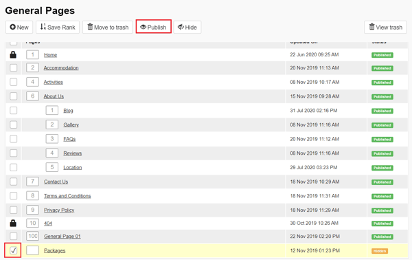
💡 Things to Remember:
-
Before you select a template: Within the Rich Text Editor, type is some text to act as a placeholder, then hit Enter to set your cursor on the next line down; you can now select a template. After inserting a template, add your cursor to the first line of text you typed, then hit enter again and insert your next template. This helps to keep consistent spacing between each template down the page.
- Use only pain text in the URL field: The URL field does not like anything other than plain text, so the use of words with, apostrophes or symbols that have been added to the CMS Label field should be removed from the URL field before you save your changes e.g.: Dave's Taupō Trips & Tramps will display a 404 page on the front end; you'll see that URL will display the text differently:
-
Menu Label: Adding text to this field sets the name of this page to appear in the topline navigation. Leaving it blank means that it will not appear in the topline navigation options.
- Featured Highlight Selection: Remember that you cannot select a Featured Highlight that has already been selected to display as a Highlight. If the same Highlight is selected for both the Highlight and Featured Highlight sections, the Featured Highlight will take priority. This means that the selected Highlight will not show or be removed from the Highlight section on the front end, as this will be featured in the larger Featured Highlight.